
How to Create a Dark Mode Toggle in Webflow

If you want dark mode in Webflow, you need two things: a theme system and a reliable switch.
This approach uses Webflow Variables and variable modes for design consistency, plus a small script that applies the user’s preference before the page paints.
What you’re building
- A Theme variable mode that maps light colors to dark colors
- A
.darkclass that flips the site into dark mode - A toggle button that changes the mode and persists the choice
- No flash on load, even when pages are heavy
Step 1: Build brand color tokens first
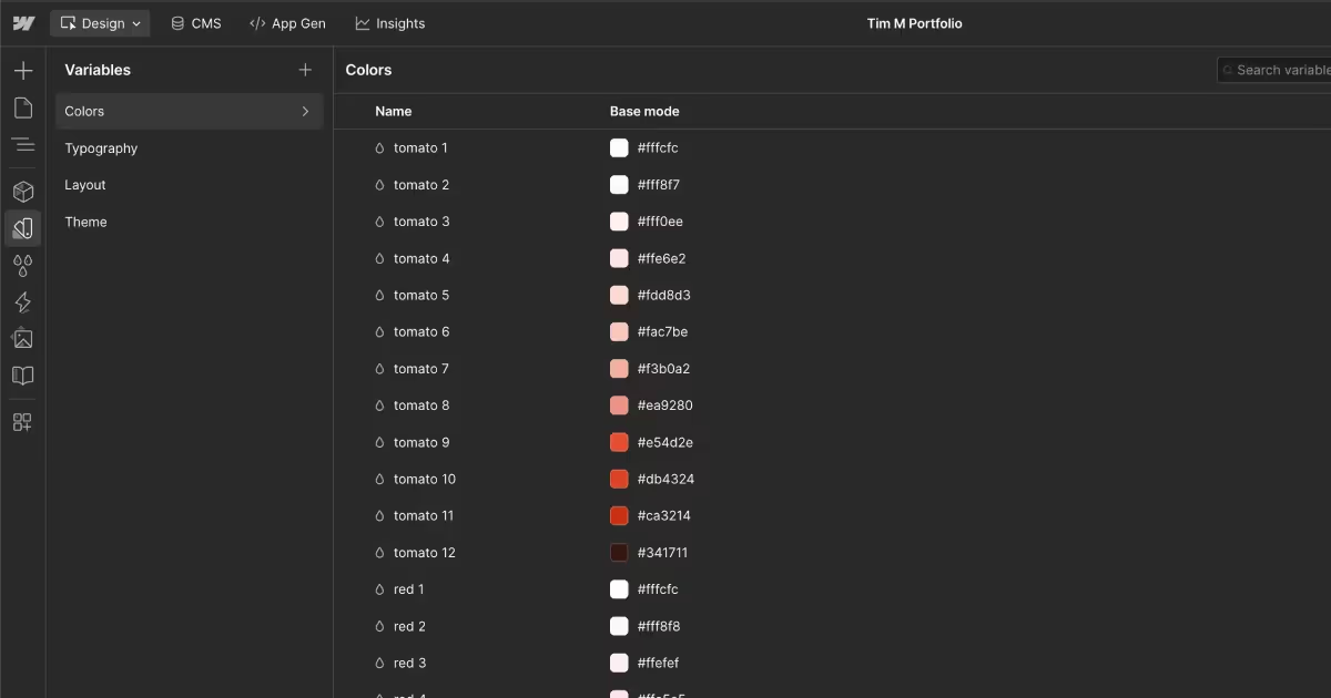
Start with your brand palette in Variables → Colors. Keep these as your raw tokens. Examples: blue 2, blue dark 3, mint 5, blue dark 12.
These tokens should not describe usage. They describe the palette.
Tip: If you have a fixed brand palette, use those colors as your base tokens. If you want more flexibility, start with an accessible color system that includes light and dark scales, like Radix Colors. It gives you consistent steps for surfaces, text, and UI states without inventing every shade yourself.
Step 2: Create theme variables that pair background and content
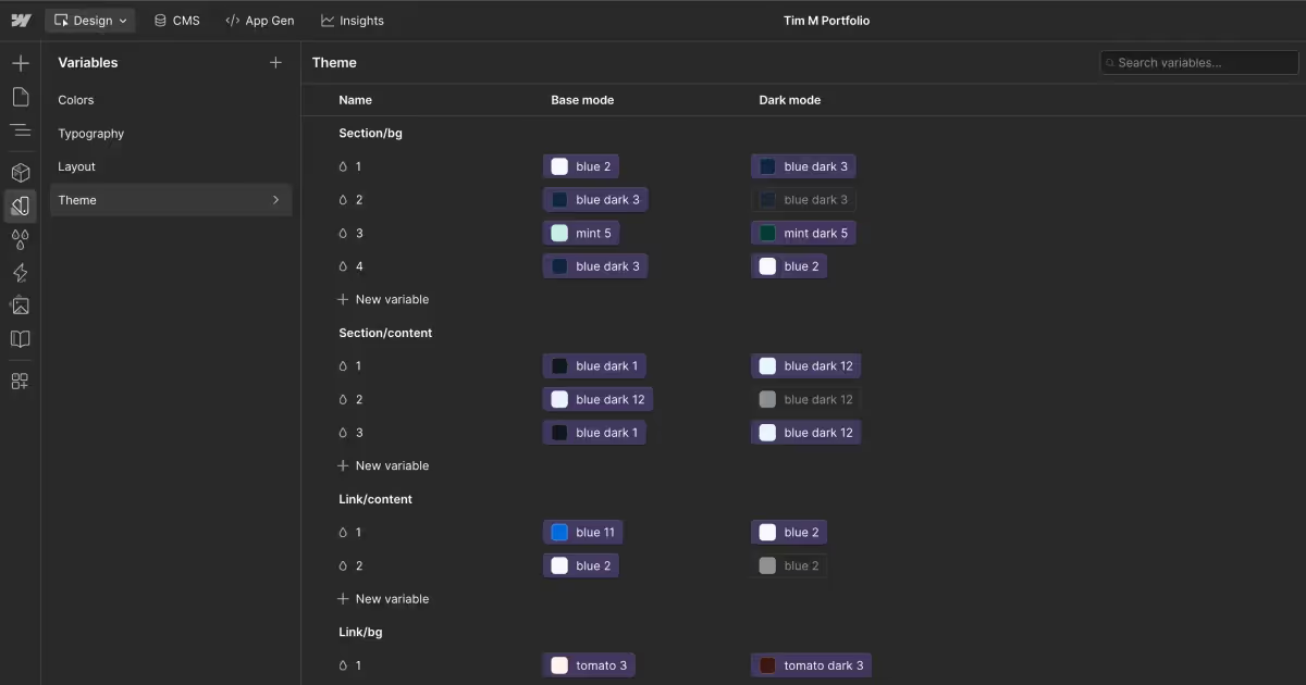
In Variables → Theme, create semantic variables that match how you design sections.
I treat each section as its own “surface,” with a default foreground color that everything inside should inherit.
That’s why I create theme variables in pairs. One variable defines the surface background. The matching variable defines the default content color for that surface, including body text, headings, and icons.
When you switch modes, the pair flips together so contrast stays intact.
You can create as many section pairs as you need. Each pair represents a reusable surface style across your site, like primary sections, alternate sections, muted sections, or accent sections.
Example naming that scales:
section/bg/1maps tosection/content/1section/bg/2maps tosection/content/2
Then map each theme variable to a Base token and a Dark token.
Example:
section/bg/1→ Baseblue 2, Darkblue dark 3section/content/1→ Baseblue dark 1, Darkblue dark 12
Core rule: when the background changes, the default content color changes with it.
Step 3: Apply theme at the body level, then override per section
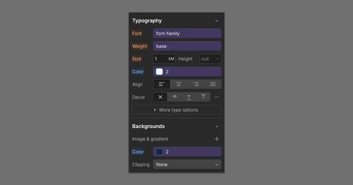
I start by setting a default surface-and-foreground pair on the Body element. That gives every page a consistent baseline without having to style every section.
On the Body element, set:
- Background color to your base surface variable, like
section/bg/1 - Text color to your base content variable, like
section/content/1
Then, only when a section needs a different surface, override the pair at the section wrapper level:
- Background color to the
section/bg/*variable for that surface - Text color to the matching
section/content/*variable
This keeps most sections “free” because they inherit the body defaults. You only apply section-level styling when you actually want a different surface.
Step 4: Handle exceptions like cards and pills
Some elements should not inherit section colors because they introduce a new surface or a distinct color system:
- Cards with their own background surface
- Links with a distinct text color
- Badges, pills, and UI chips
For these, extend the same pairing framework you used for sections. Create additional background and content pairs that can flip cleanly between modes.
Examples:
card/bg/1maps tocard/content/1pill/bg/1maps topill/content/1
Tip: If a component does not need to change between modes, skip the Theme layer and style it directly with your base color tokens.
That keeps the theme system focused on mode switching, not on documenting every color decision.
Step 5: Add a toggle button in Webflow
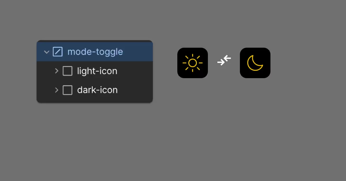
Create a custom element in your header, set it to a button, and include two icons:
.light-icon(shown in light mode).dark-icon(shown in dark mode)
Add attributes on the button:
data-toggle="dark-mode"aria-label="Toggle color mode"
That supports simple JS selection and accessibility.
Step 6: Prevent theme flash on first paint
Put this in Site Settings → Custom Code → Head Code. It applies the correct mode before rendering.
<!-- Immediate Theme Apply (prevents flash) -->
<script>
  const isDark =
    localStorage.getItem('theme') === 'dark' ||
    (!localStorage.getItem('theme') &&
      window.matchMedia('(prefers-color-scheme: dark)').matches);

  if (isDark) document.documentElement.classList.add('dark');
</script>
Step 7: Add icon state styles (optional, but useful)
Keep this in Head Code under your script, or in a global stylesheet. It swaps icon visibility based on the .dark class.
<style>
  .light-icon, .dark-icon {
    transition: opacity 0.3s ease, transform 0.3s ease;
  }

  :root:not(.dark) .light-icon { opacity: 1; transform: rotate(0deg); }
  :root:not(.dark) .dark-icon { opacity: 0; transform: rotate(90deg); }

  :root.dark .light-icon { opacity: 0; transform: rotate(-90deg); }
  :root.dark .dark-icon { opacity: 1; transform: rotate(0deg); }
</style>
Step 8: Persist the user’s choice with a toggle script
Put this in Site Settings → Custom Code → Footer Code.
This version keeps your logic, and also toggles on document.body as a safety net if you attach variable modes to Body.
<script>
window.Webflow ||= [];
window.Webflow.push(() => {
  const toggleButton = document.querySelector('[data-toggle="dark-mode"]');
  const darkClass = 'dark';

  const setTheme = (isDark) => {
    document.documentElement.classList.toggle(darkClass, isDark);
    document.body.classList.toggle(darkClass, isDark);
    localStorage.setItem('theme', isDark ? 'dark' : 'light');
  };

  const storedTheme = localStorage.getItem('theme');
  const systemPrefersDark = window.matchMedia('(prefers-color-scheme: dark)').matches;

  setTheme(storedTheme ? storedTheme === 'dark' : systemPrefersDark);

  if (toggleButton) {
    toggleButton.addEventListener('click', () => {
      const isDark = !document.documentElement.classList.contains(darkClass);
      setTheme(isDark);
    });
  }
});
</script>
Does it persist across sessions?
Yes. localStorage persists until the user clears site data. When they return, the stored value overrides prefers-color-scheme.
Step 9: Create a .dark class that switches your Theme mode
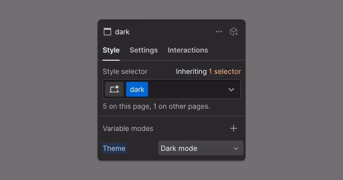
Your JavaScript can only toggle dark mode if your .dark class actually changes the Theme variable mode in Webflow.
To set it up:
- Create a class named
.dark. - In the Style panel, set Variable modes → Theme to
Dark modefor that class.
Once .dark switches the Theme mode, the custom code does the rest by toggling the class and saving the user’s choice in localStorage.
Note: Make sure the .dark class is used somewhere in your project (even on a hidden element) so it doesn’t get removed during cleanup, since your script relies on it to switch the Theme mode.
QA checklist
- Load the page in an incognito window, confirm no flash.
- Toggle dark mode, refresh, confirm it stays.
- Test with system dark mode on and off.
- Tab to the toggle and activate it with Enter or Space.
- Spot-check contrast on text, links, and muted UI.
- If you use per-page custom code, confirm the toggle script is global in Site Settings so it runs everywhere.
FAQs
Does Webflow have built-in dark mode?
Webflow has Variables and variable modes, but it does not ship a turnkey dark mode toggle. You create the mode and control it with a class and a small script.
Should I use prefers-color-scheme?
Yes. It is the best default. Then let the user override it and save their choice.
Where should I apply background and text colors?
Apply them at the section wrapper whenever possible. Use component-level theme variables only when a component needs its own surface and content colors.

Tim Mudd is an inter-disciplinary marketer, with expertise in strategy, design, and development. He currently leads Web Ops and Content Strategy for a leading healthcare education brand.